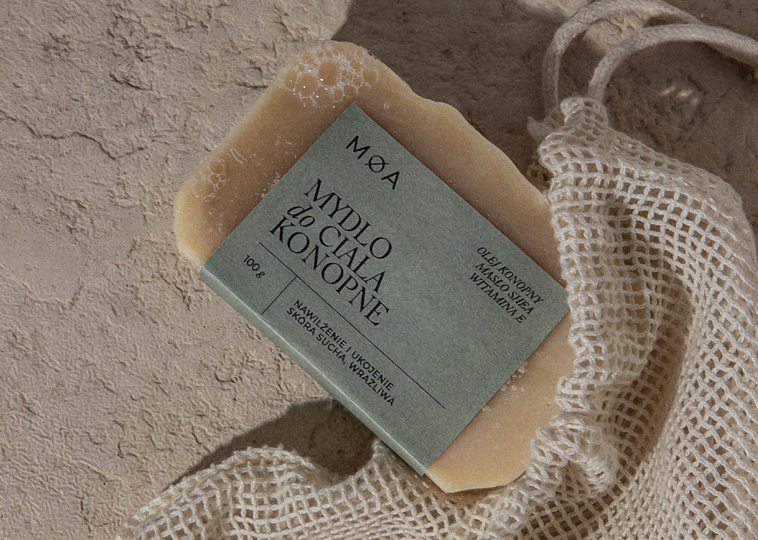
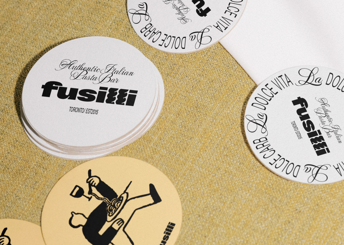
Thirty years after my Mom designed the original logo for my Dad's chiropractic practice, I had the honour of redesigning it to reflect his three decades of experience.
The move to a new space presented a great opportunity to revamp the brand. My goal was to embrace a modern and minimalistic approach while staying true to the legacy; capturing the essence of his expertise.
The new redesigned logo exudes confidence and refinement. Clean lines and sleek typography convey a sense of modernity and professionalism that improves readability across various marketing materials. The colour palette was carefully selected to be small yet highly contrastable, easy to manage for a small-scale business and allow a memorable brand presence across various touchpoints.
